Everyone seems to be struggling a little again, so it’s time for another call with Kevin! Again this call with very helpful, and re-energised us.
Kevin’s call helped me to understand issues on what a couple of our team mates where facing. They felt directionless, as they just had no idea what to make, or what to make around. He suggested a few ideas, such as attatching the zipties to fish nets, a technique I tried out immediately after the call as I really wanted to see what the effect looked like.
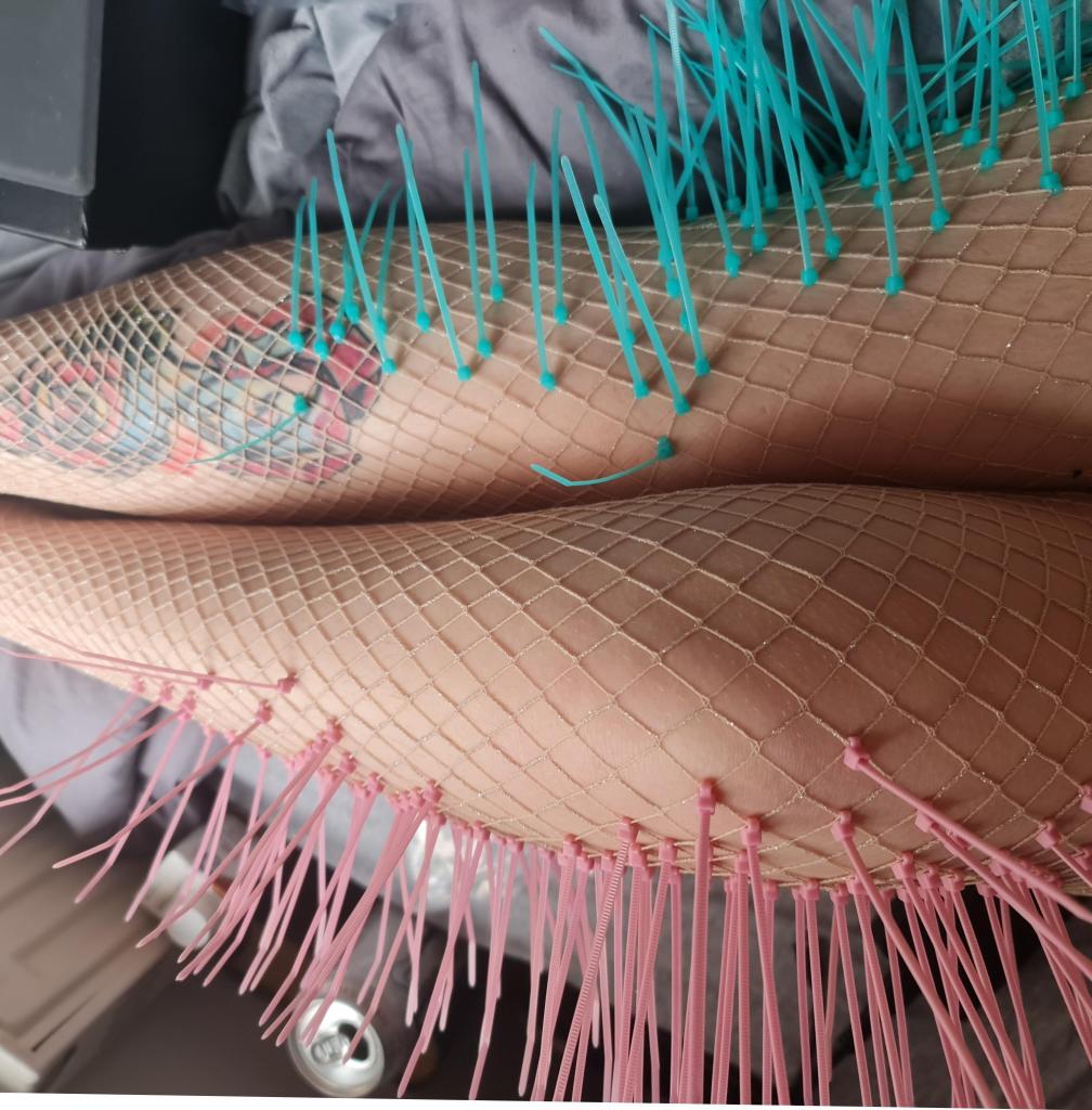
I really love this effect, and it inspired me a lot, but I end up not using it myself. Definitely keeping this in my memory for other projects though – the way they move and shimmer is so cool.
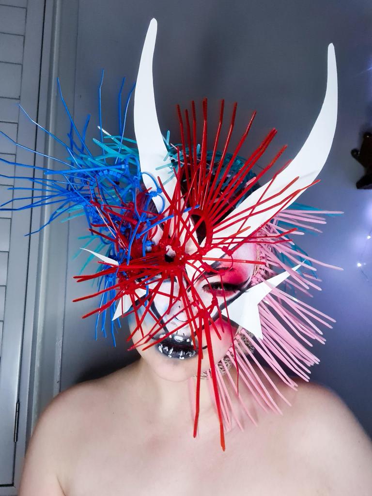
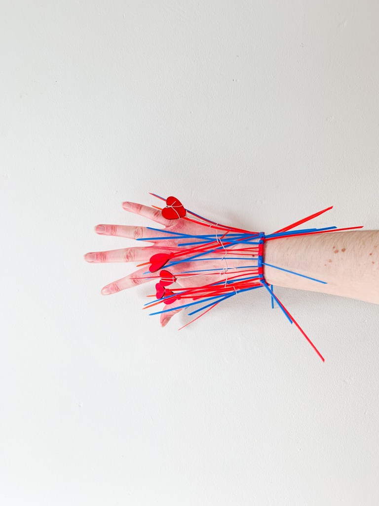
This also gave me an idea on how to help the others feel less directionless! We were all naturally drawn to different bodyparts, that are mentioned or alluded too by the song, so, I suggested that we make thing for those body parts! I was already in the process of making a headpiece, Sonya was drawn to making a chest piece/necklace, Tilly wanted to do hands, and Nicole thought of feet.
With that knowlege to hand, I suggest that for our foldout vinyl album, why not make it so it’s like a body put together? We discussed for awhile, and I drafted up a couple of incredibly (bad) sketches, and we finally felt all on board again! Below is all of our body parts put together.
Because I really enjoyed the drag look in our Pinterest board, and also knowing that Bjork has worked with drag artists, I tried my own hand at making something inspired by that. I really love what everyone has made so far, and I can’t wait to piece it all together.
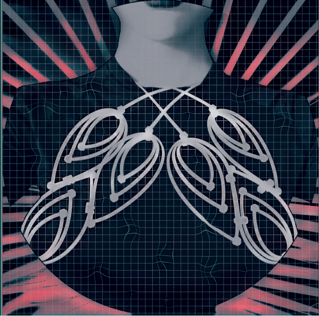
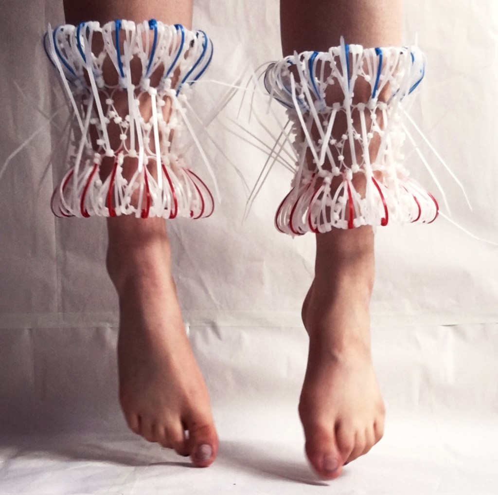
I didn’t have a copy of Sonya’s unedited photo to hand, but I do have the rest of ours! Sonya’s phototho really helped us pick a directiont that we wanted to go in. I love how the grid effect to me looked like soundwaves somehow, espeically when they were warped around. Also using some of the zipties in the background of the piece, but not a center focus, was really helpful in terms of decided on a coheasive visual look. I can’t remember if I mentioned in a previous post, but just incase I haven’t – We had decided on the blue and red colour scheme very early on, as a couple of things we had noted in the song lyrics was themes of blood, ice and fire. Blue and red are also complimentary colours, so it will crete a strong visual language.
I can’t wait for all our edited work to get together, and see how it is developed from here!

Leave a comment